For my walking animation, I wanted to play more with the background design, as I have some interest in it and can see myself taking it more seriously. I knew I wanted to have a bakery or a sweet shop, which is where the mood of the walk changes as the shop is closed.
I started out with a moodboard of different storefronts.
And then I got to work!
It’s a simple straight-on background with a one-point perspective. It’s not a finalised design, but I am relatively happy with the first pass on it. I didn’t want to over-crowd it and I tried to keep the threes – big, medium, small – rule in my mind. I will possibly add some more detail to the pavement, now that I’m looking at it. I’ve also moved the plants to the side, so that they weren’t the centre of attention, and there was more focus on the bakery.
I also got some feedback from a friend, and when cleaning it up, I will try to keep in mind line weight and try to vary it by structure. Also, the canopy might have too much detail in perspective, so I would be looking to simplify that.
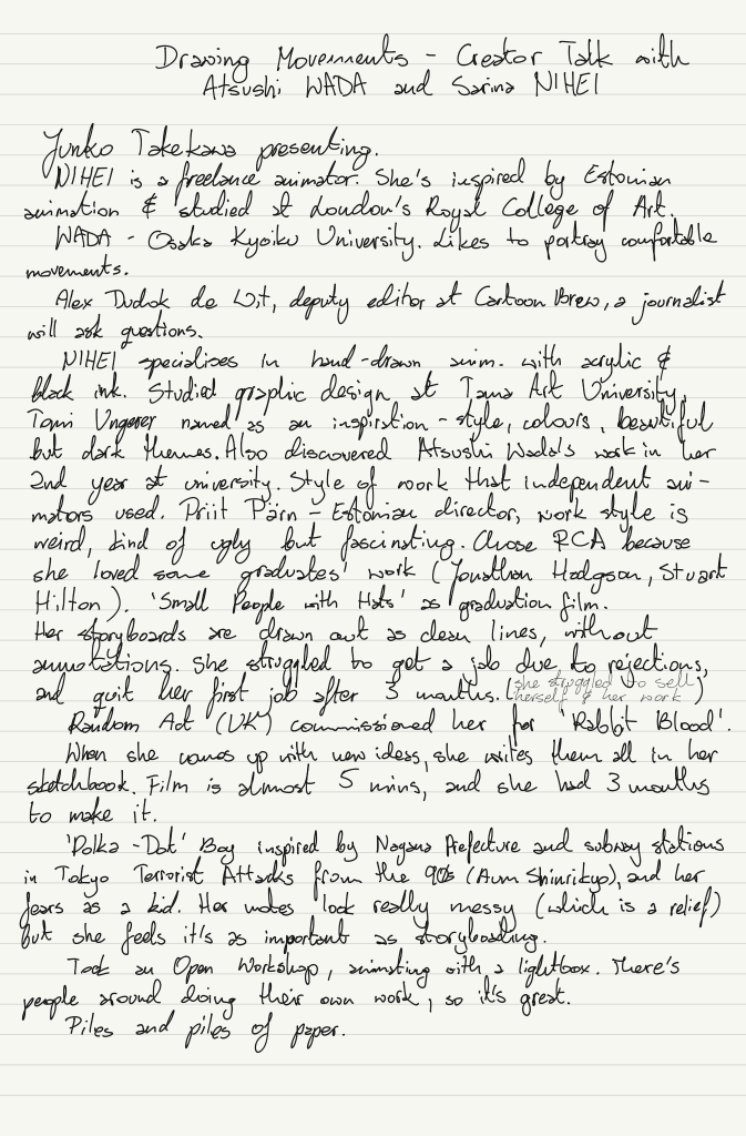
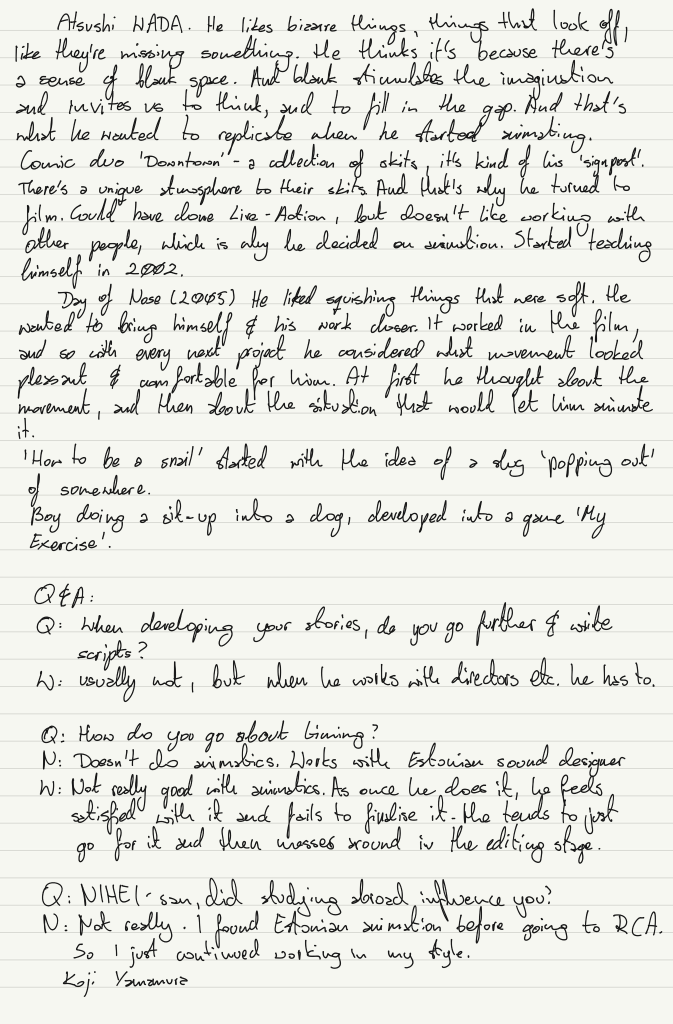
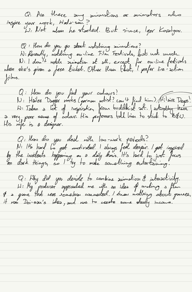
Today I’ve attended a webinar from The Japan Foundation about Atsushi Wada and Sarina Nihei’s work. Below are their works, the notes I took during the webinar and some of my thoughts.
Gentle Motions: Atsushi Wada’s Short Animation
My Exercise – Gameplay (Atsushi Wada)
Small People with Hats | Future Shorts (Sarina Nihei)
It was quite interesting to see the work of Japanese animators, who are inspired by the work of artists from other countries. It’s not the typical style of animation that a lot of people think of when they hear ‘Japanese animation’ (at least I don’t). It’s unique to them, and hearing Wada and Nihei talking about their work was super inspiring. I absolutely love the soft but limited colour palettes they use.
They both talked about how they don’t really write scripts, and they tend to start their animations by thinking about a pleasant movement that they want to animate, then work out the rest of the film around the scene. This was rather relieving, because that’s how I tend to work too, and for the longest time I thought that was just ‘wrong’. Nihei also tends to write a lot of ideas down, before working on the storyboards, so there’s a lot of scribbles in her sketchbooks.
I really enjoy these soft, comfortable movements in their work, and it’s something I would definitely like to consider in my future work. I’d also like to be a bit looser in my ideas ‘plot-wise’.
Although not part of the project, I wanted to share how I approached the design of one of my Dungeons and Dragons characters. I first started by creating a moodboard. I wanted an overall feel, a vibe, not necessarily something to strictly follow, but something that could inspire me and keep me on track.
Afterwards, I worked on the silhouette and design, using white, grey and black as I tried to consider the values at the same time. I tried to keep in mind how practical the outfit would be, while still staying true to the character.
I really liked the ‘heavy on the bottom silhouette and tried to push it further by layering different pieces. I’ve decided the shorter dress / skirt was more practical, as she was to be a fighter, and of course, I don’t want her tripping on the edge of the fabric.
I’ve actually taken some videos of myself (long deleted, spare me the embarrassment) to figure out the pose and proportions. The final design reminds me a little of SheRa design.
Of course, I couldn’t help myself and had to draw her with her orc wife, Mursha. I also played about with different light settings.
Today we looked into animating using Adobe Creative Cloud Animate. I find it’s quite different from TV Paint, but because it’s vector-based, the lines and shapes can be resized without losing quality. We started out by creating a character inspired by the shape of an item we had around us. I had a pepper grinder on my desk, so I used the textures and shape of that but turned the peppercorns into gumballs. The character’s name is Pepper in homage to that.
Next, we looked into frame by frame animation within CC Animate. The Onion Skin is a bit more confusing than TV Paint, but it’s much more accepting of copying and moving items within frames. I decided to just animate one of Pepper’s gumballs, as I wanted to keep it really simple and just familiarise myself with the program.
We also looked at turning animations into Symbols that could have been animated further via tweening. One mistake I did was turning the frames into a Movie symbol. It’s really important to turn them into a Graphic symbol, so that the animation is preserved. I know the highlight wouldn’t have moved, but I’ve done it for the purpose of the exercise and I really like how it turned out actually.
I think this might be a good way to animate the mood walk change, but I’m not sure how to time it right. So it might be something I will explore.
Making a horse walk is much more complicated than I anticipated. I had a hard time getting my head around the concept and would definitely be unable to animate one without a reference. I found that animating the back legs first, then going back to animate the front was more manageable than doing all of them at once.
It’s currently animated on threes, but I might add more in-betweens to take it down to twos. I also need to add a tail.
As per Steve’s feedback, I might make the neck move more. And also need to ensure the steps are the same size. The lines can be simplified – the less the better. And the legs that are further away, can be higher off the ‘ground’ due to perspective.
I’ve started watching Hawkeye, and I must say I’m impressed with the opening credits. It’s clearly very heavily influenced by David Aja’s work (who apparently, unfortunately, did not get compensated for this) and is very graphic. Although the animation is minimal, it is just enough for its purpose. The opening credits explain the character’s story t us. It also looks like it could have been made with CC Animate due to its graphic nature. The cohesive colour palette works great with subtle textures that add dimension.
During a workshop with Bianca Ansems, we were asked to create a character using Stanislavski’s 7 steps of character exploration, then to create a turnaround. I wish I knew we were going to be asked to do that, as I don’t consider myself a strong character designer. And so I’ve spent quite a long time just researching the background and exploring the design. I will definitely be spending more time on this.
A cleaned-up design. I realise the side profile is not right at all, but I anticipate to re-do the design anyway.
[1] Hi everyone, so I’m going to try and do this with auto-generated subtitles. It’s going to pick up the names wrong, because they’re Polish, but oh well. So I’d like to introduce you to Witold Giersz, a Polish animator, whose material of choice is usually paint.
[2] He was born in 1927, so before the Second World War. He wanted to be an artist, but his parents persuaded him not to, for the fear of him not making any money. So he studied economy at university. But in 1950 he saw a job offer for animators at a new studio in Bielsko-Biała, and took the risk. He quit his studies and the job at a time. When he went to interview for the position he had prepared a portfolio with drawings in the style of Disney but was told the studio were trying to update the film style, and have it influenced by Polish artists. He still got the job, though, and his dream was coming true. He learnt under Lechosław Marszałek, a very respected animator at the time. In 1956 he started the branch of the studio in Warsaw and directed his first film, which he was very dissatisfied with. Due to communism in the country at the time, the animators couldn’t release political films and a lot of work was comical, or made for children. Now, I’d like to show you a little showreel of just few of his auteur films.
[3]
[4] Giersz wasn’t satisfied with drawn animation, so he started experimenting with paint. He was fascinated with auteur films, because the artist was responsible for everything and it opened a world of experimentation for him. When he was making the Little Western, Norman McLaren visited the studio and liked his work very much, which encouraged Giersz. He wasn’t afraid to experiment with the medium and took full advantage of it, making the characters aware of it as well. They lift up water, paint the environment, and the blue and yellow cowboys combine to create a green one. His lines are simple and graphic, and he relies on the body movement and sound to convey the emotions rather than character’s face. He also wasn’t afraid to include real objects in his films – you can see a tube of paint, and in Red and Black a mirror. Little Western was screened at the Annecy Festival.
[5] Giersz was inspired by French impressionist painters and the depth they achieved by using knives for their paintings. He was worried that rubbing the character out of the background, to paint the next frame would look like a technical error, but instead he decided to use it to his advantage as a background effect to add more interest to it. He then used the same effect in his later work, The Fire, as the pulsating effect made the fire more effective. According to Parks, The Horse was likely the first paint-on-glass film in the world to be widely shown in festivals.
[6] In 2017, the artist gave a live presentation. He used a painting knife and paint straight from the tube, applying the paint directly on glass, using sketches underneath as a guide. The sketch was then removed and a photo taken, before forming an animation.
[7]The Star is probably his most controversial work and one that got him in trouble. tells a story of heavily controlled city, where a star appears in the sky, giving people hope. It draws from themes of Big Brother, as well as Christian religion. The script was originally approved by the authorities, but Giersz ran into problems when they saw the finished animation. The film was heavily censored internally already. Instead of showing queues of people waiting to the shops, the artists only painted the shoes. During those times, people had allowances, or vouchers, with what they were allowed to buy. My mother would actually tell me stories about how she tore her tights and my grandma didn’t have anymore vouchers to buy her new ones. On top of the censorship, it turned out the Finnish production partner didn’t have enough funds to cover their part of the contract, and announced they could not give funding to anti-soviet story. When the animation was finished, the commission did not like the theme of an all-seeing-eye and wanted Giersz to remove it, which he refused to do. Due to this the film was banned from being distributed or entered into any festivals, and Witold never got to make the three remaining parts. After threats from of holding back money and not paying the artists, as well as lack of support from his colleagues, Witold quite his job in the studio in 1985.
[8] Giersz’s most recent work is inspired by cave drawings from Lascaux, Altamira, Teruel, and others. I actually had to email him to ask for a copy, as it’s not available anywhere that I could find. His intention was to bring the expressive drawings to life, to perhaps make them what the original artists intended them to be, now that technology allows it. But he still chose to use the medium people back then would – charcoal and clay. He drew each new frame on the stone, then removed the previous frame’s lines before photographing the image. He also used the stone’s texture in interesting way, forcing the perspective as the horse runs away. Of course, Witold Giersz inspired many artists and productions with his work, despite the technique being so time consuming. One of those artists is Joanna Jasińska-Koronkiewicz. I’ll play you a short clip of her work, so you can see the clear influence.
[9]
As you can see, she also paints frames of her animations, although she uses oil on canvas rather than glass or celluloid. Witold Giersz actually saw her work and was very happy that someone is taking painted animation seriously. Perhaps there’s one painted animation you guys are more familiar with…
[10]
[11] The film Loving Vincent was the first feature length film created in painted animation and was produced by BreaThru Films. The scenes were filmed, then projected onto the sheet and painted. It was basically rotoscoping but with paint. Witold Giersz mentioned had rotoscoping equipment in the Warsaw studio in 1956, but the technique never took off in Poland at the time. Although rotoscoping is often frowned upon in the industry, Giersz says the audience doesn’t care about the technique as long as it’s effective and they like it. Although he doesn’t deny it simplifies the process greatly. Despite this, the film was a great success and the studio is now working on another painted feature ‚The Peasants’. It’s one thing if rotoscoping is used… But what if AI could paint the film for you?
[12]
EbSynth is a program which let’s you paint over the key frames and fills in the gaps. It’s undeniable that it’s amazing, but still. It seems to lack that… Personal artistic touch to me. It lacks the aesthetic. Is painting a waste of time? Is a realistic painting useless, because you can take a photo, or is it even more incredible? Still, perhaps if the artist has to spend less time on tedious tasks, it allows them to be more creative. And it coul be very useful in 2D animation to colour in and add shadows… I’ll leave you with that as something to think about. I’ve also asked Witold Giersz if he had any advice to current animation students….
[13] „Dear Weronika, for every creator – painter, graphic artist or even a sculptor – enriching his work with the element of movement, creates a completely new field of artistic activity. Dear young artists, try to transfer your own, individual style into the world of animation. In films which you’ll be making, you can – depending on your own preferences – convey your own thoughts on any topic, or bring to life abstract forms which, changing their compositional or colour arrangement, will react differently to each other with the passage of film time. Both paths can bring huge satisfaction. I wish you all success.”
A little animation of a Soot Sprite from Spirited Away to get more accustomed with the tools. It can definitely be improved as per Steve’s revisions – the arms seem too long in a couple of frames and should be adjusted.
This was my second attempt, this time with Sandshrew – whose design is similar to the armadillo, hence the rolling up. As per Steve’s revisions, I would like to work on the tail more and add slight squash.