For anyone who can’t be bothered to read the whole book (how dare!) Levy summarises the teachings at the end of it. Here’s a complete list that I’m absolutely planning on printing out and sticking on the wall, so I can always remind myself to keep growing. It’s not going to be easy, but it’s important to keep on pushing and improving.
Having read the book, although it took time as I decided to take notes for future reference, I know it was full of valuable advice.
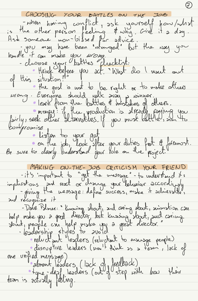
Knowing my personality type, I would definitely prefer permanent/full-time employment over freelance gigs here and there – I feel constantly needing to find a new job would give me anxiety. I’m definitely what’s described as a ‘house-cat’.
Even if the job is creative, it is important to have a different creative outlet outside of it – this way your ego doesn’t become attached to the work, and you’re better at taking feedback as it wouldn’t be as personal.
When Palmer talked about bad leadership, I was surprised at how easily I could think of examples from my day jobs of people who were reluctant, disruptive, absent or tone-deaf and that truly affected my work. It is absolutely my goal to not become one of these people as I would hate to negatively impact my team and their work – the animation industry so heavily depends on teamwork.
Another thing I picked up on was how important it is to make connections in the industry. I will definitely be looking to join a group in London and try to attend or volunteer at London Festivals. I’m not great at cold emailing or reaching out, but this is what’s called growth, I guess.
I suppose I gotta stick my neck out to get a foot in the door.
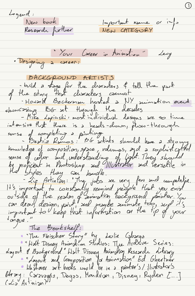
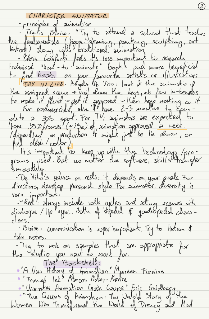
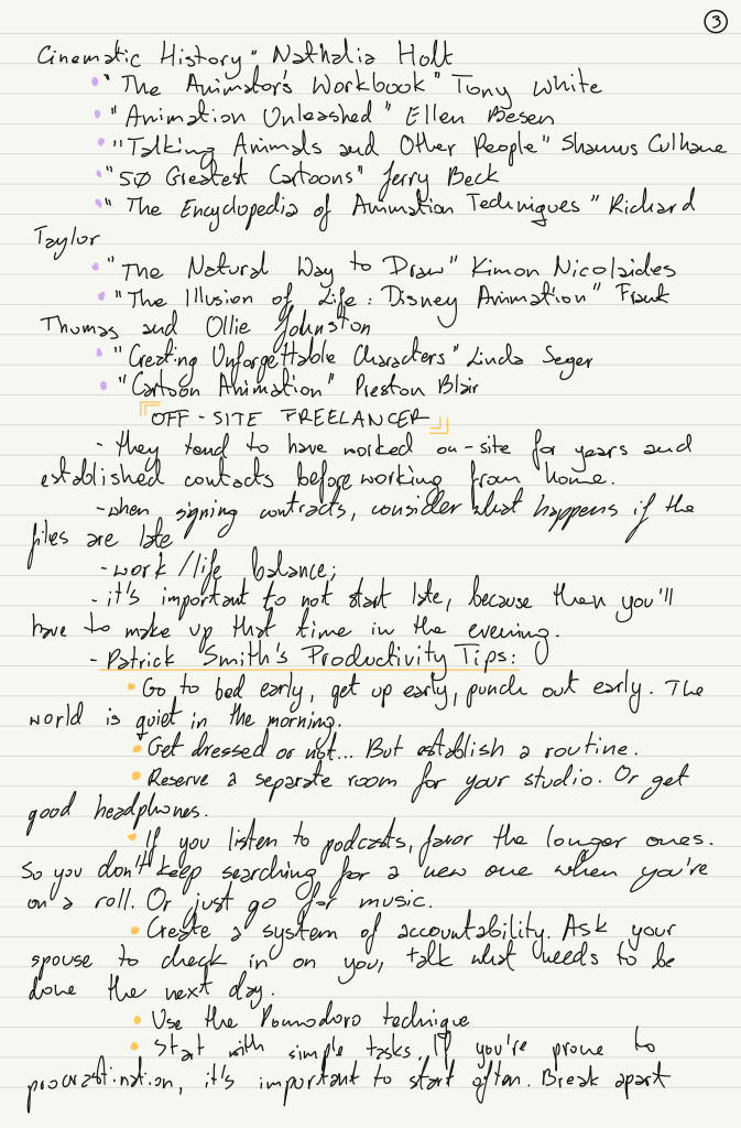
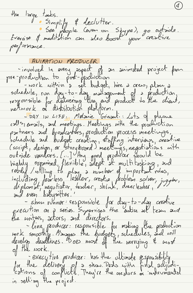
I started reading “Your Career in Animation” by Levy to gain more insight into the animation world. I especially focused on the roles I’m personally interested in, and Levy mentioned a lot of other resources which I’m hoping to look further into.
Turns out I also heavily misunderstood what a Producer does, and I would actually be really interested in looking into it the role, as I love organisation, and charts, and trackers.
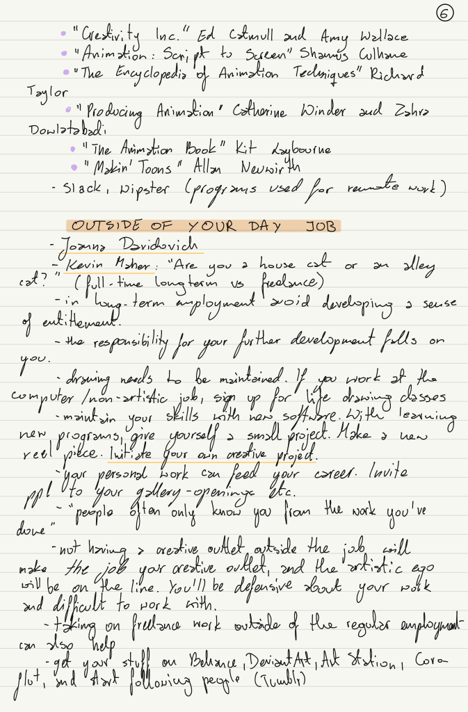
Books I would like to read next:
“Producing Animation” by Catherine Winder and Zahra Dowlatabadi (Prod.)
“Delivering Happiness” by Tony Hsieh (prod.)
“Creating Unforgettable Characters” by Linda Seger (Anim.)
“Walt Disney Animation Studios the Archive Series: Layout & Background” (Background)
In July I attended 3 different webinars focusing on starting your own brand. 2 of those were organised by UAL, while the other one was organised by roundhouse.
A lot of advice centres around DO NOT WAIT and GET OUT THERE.
Leila talked about the importance of smaller companies – many people have dreams of working for giant companies (Disney, Pixar…) while it might be easier and even more beneficial to look at small studios.
Gavin stressed the importance of just doing the project you want to do, rather than waiting for an opportunity to come to do it.
I’m glad I took part in these webinars, as they opened my eyes to different avenues nd different approaches to personal creative work.
As soon as I knew whom I was paired with, I emailed Nicole. The initial communication was very quick, and we quickly swapped to instant messaging rather than email – as sending one-sentence emails wasn’t really useful and was more difficult to keep track of.
We got onto a video call and discussed Nicole’s project, she showed me the animatic and talked about the concept – basically gave me the whole pitch. This made me super excited to work on her film as I really love the aesthetic and story of it.
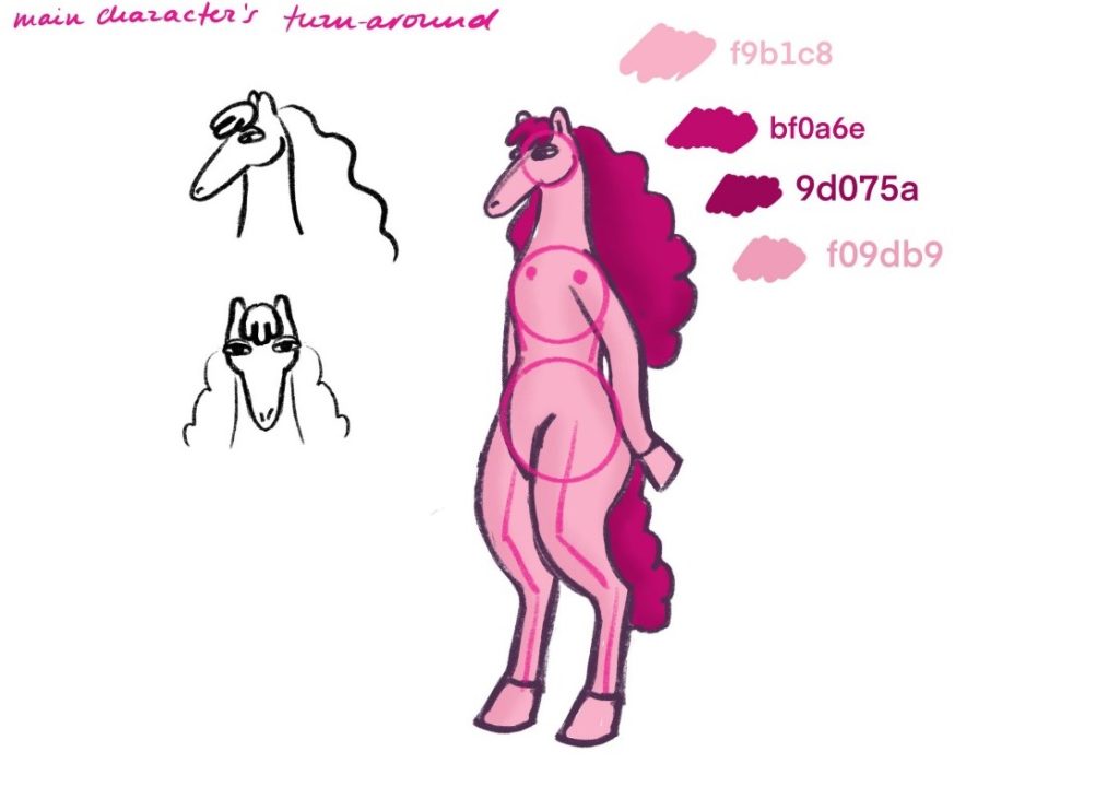
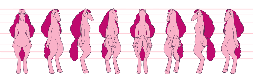
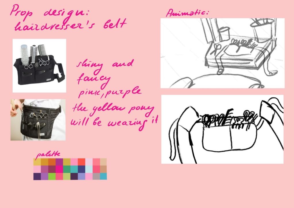
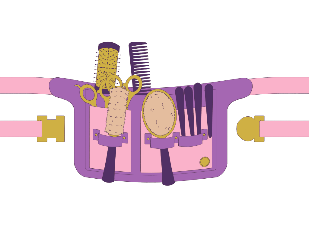
I’ve received three tasks: A Pony Character Turnaround, A Hairdresser’s Belt Prop Design, and A Background to paint. I’ve successfully completed the first two, but I am planning on painting the background later in the week. Prop and Background design is something I’m currently interested in, so I was looking forward to them.
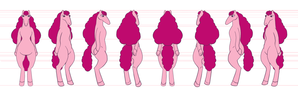
A sketch I got from Nicole and the completed turnaround I did
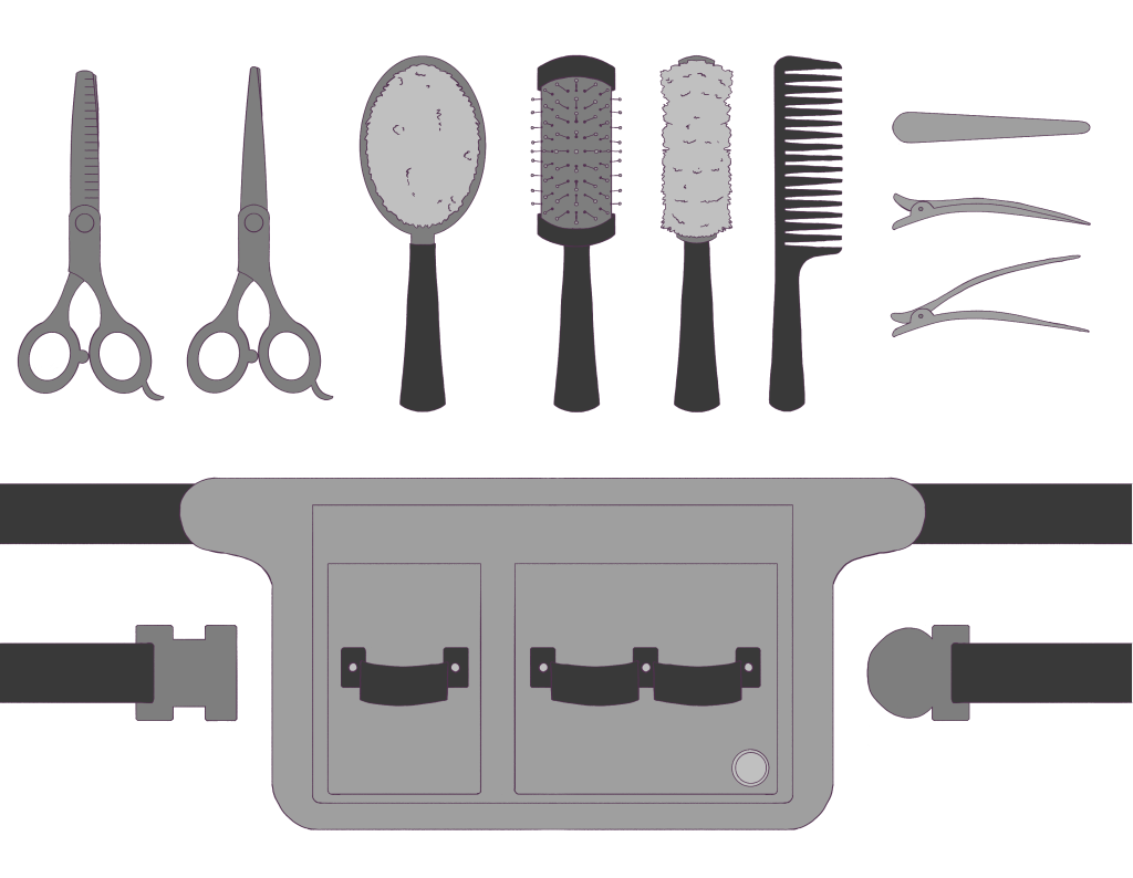
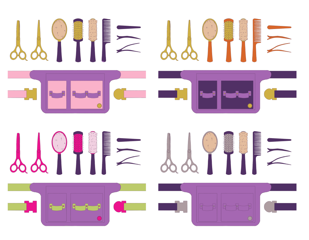
A sketch and colour palette I got from Nicole as a guide. I then designed the props separately, before exploring colour combinations (Nicole specified the bag to be purple) and then combined everything for a final shot.
I don’t consider myself a good character designer at the moment, so I was glad to have the Pony design given, and I was happy to make a turnaround from it. I tried to utilise the knowledge I had from Bianca, when she came to talk about character design. I knew the importance of a good and consistent turnaround, using the lines in the background to keep track of various features. It made the task much less daunting.
On the other hand, I was very happy to have the Prop design more ambiguous and given more freedom in working with it. I did the research to make sure all the tools were included but opted to go for a soft bristle brush – inspired by horse brushes, as I felt it would fit the Pony World better. Following this, I definitely plan to look more into Prop and Background Design artists and their workflow. I’ve also purchased Melissa Malone’s intro to Background Art for TV Animation to start my research and to get more familiar with the requirements.
The work was done over the weekend, then the designs were sent off to Nicole for approval, and she really loved the belt – I’ve probably put into it more detail than she would have been able to, due to the fact she’s got so many other things to work on, and I could easily focus on it. But I’ve decided to put this amount of detail in because it’s the main prop, and it seemed like there will be close-up shots of it. Nicole also said she’ll just add the grunge texture to it so that the grain matched the aesthetic of the film – so I didn’t need to do any revisions! I also made sure to send her the raw files, so she could use them for models on any shots. It was very satisfying to send off work that got approved.
I wish I followed up sooner (our communication broke for a bit and I had to wait for a little to receive work) – as it wasn’t Nicole’s fault and life happens. But because I waited to be sent stuff after the initial call, it put extra pressure on me later, as I needed to fit it around other tasks in the latter week. So in the future, I’m definitely going to try and be more insistent on communication.
As well as this, if I had more time, I definitely would have liked to render the designs further- adding shading. It’s something I still might do later on. But I’m definitely looking forward to painting and designing the background from Nicole’s sketches. I particularly enjoyed seeing her workflow – the moodboards, the animatic and her pitch, her energy making me more excited about the project. It’s definitely something I would like to bring into my practice.
I’ve recently watched a short music video by Gaille/BishyFishie (both sang and designed/animated) and was absolutely mesmerised by the colour choices and the transitions. So, naturally, I needed to look more into it.
In the process video, they explain their workflow from planning and designing to making. I was actually surprised to find out they used Paint Tool Sai to paint each frame, export it as images and put the animation together in Sony Vegas. It truly shows that where there’s a will, there’s a way.
I personally have experience using Paint Tool Sai for illustration work in the past and, honestly, it’s the best program I ever experienced for lining and colouring. The brushes always did what I wanted and expected them to, just perfectly. Despite this, I can’t imagine not being able to playback the frames, hence why I don’t think I would ever use it to animate. However, I can see myself making the rough animation in TVPaint with all the timing figured out, then working on individual frames in a more illustrative program (such as Paint Tool Sai or Clip Studio Paint). The downside is, of course, the frames need to be exported as PNGs so any changes, later on, could be difficult to carry out.
I did really enjoy the way Gaille works out their frames/storyboards. They use a set of post-it notes in a sketchbook. This is certainly something I would like to adopt into my practice, mostly because I find myself moving frames around a lot – and when doing work digitally, it can become quite messy, trying to move between files or folders – while I imagine flipping a sketchbook page would be much easier. I worry I’ve become too digital sometimes, so I think this would be a nice way of getting back into a more ‘hands-on’ approach.
Although their colour scheme seems very minimal, I went ahead and colour-picked from multiple frames to get a better grasp of it. I quickly noticed that despite the scheme looking like it only consisted of 4 colours, it had much more to offer. Most of the colours are muted and “soft” which is what I think attracts me to them – they are easy on the eye and are in hues of reds and violets, shades of pink. Gaille avoids using black in this music video and instead goes for a darker ‘plum’ which unifies all of the design – noticing this reminded me about the talk we got from Sue Tong yesterday, where she mentioned that colouring the outline the colour of the prop/design could make the design softer, rather than having striking black lines. However, colouring the lines in n amount of different colours can be very time consuming (i.e. all bushes dark green, rocks dark grey etc.) – but choosing a single deeper colour other than black for all of the lineart can be a great way to unify and soften the art. So it’s definitely something I will consider and keep in mind.
I used to be rather scared of colour, but this quick and simple exercise definitely helped me. It showed me that I don’t need a full rainbow to have a cohesive and well-working colour palette.
On top of that, I truly love so many of the transitions and shots from the video, despite it being so short.
I really like how some frames ‘jump’ to the beat of the music. Especially when they’re still frames – it gives them a little bit of movement. On top of this, it feels to me like they’re a heartbeat, which works well due to the song being about love.
However, I found myself mesmerised by the shot at 0:09 and the smooth transition into the heart, then the bedroom scene, which takes less than 2 seconds.
I wanted to understand it better and not feel so intimidated by it. So I took multiple screenshots to analyse it. If I were to approach this transition, I think I would fully animate the ‘heart-smoke’ and then slide it in during compositing in After Effects. The bedroom scene quickly jumps into the shot from the top, but there’s a more subtle change that adds to the quick tempo of the song – the background lilac colour starts transitioning from yellow smoke into the final lilac when the scallop frame settles. It’s the little details and illusions that make it so smooth.
These are all little lessons I’ll definitely try to implement in my future projects – working with minimal, limited, cohesive palettes to build up the confidence with using more colours. Also, the transitions aren’t as scary as they seem, haha!
In today’s session with Shaun we looked at various artists who use animated character on top of live-action filmed / photographed backgrounds. Or who manipulate photographs into collages and rigged characters. I was particularly interested in Christoph Niemann’s (Abstract Sunday) work (below).
His work is simple, yet experimental and unique. The simple forms move in the real world and give a feeling of unease – because they don’t belong. But at the same time look sort of quirky for the exact same reason. They’re familiar to a human figure, yet so different – doing things a person would, yet in such non-human-like ways.
His work very slightly reminded me of doodles where arms or eyes are added to animals, or inanimate objects, or of Jeremy Nixon’s work.
Given half an hour to film the scene to work with, I quickly drew a bath – I knew I wanted a simple, calm scene that I could easily finish during the 3 hour lesson. (I used Listerine for colour, and washing up liquid for foam. Also, cold water trying to waste as few resources in the moment – in the future I’d hate to waste water, so perhaps I would film similar scenes when actually making a bath for myself).
The footage ended up a bit shaky, unfortunately. Personally I didn’t like it and re-shot the scene, but Shaun showed me how to track and parent footage, so I could work with it if I ever run into a similar problem in the future.
I normally don’t like filming out and about without a tripod, but now I feel like it wouldn’t be that much of an issue. It could even add more authenticity and interest to the animation, if it ‘shakes’ along with the footage.
I began working on the short animation, which took longer than expected as I ran into some trouble with Animate CC (my brushstrokes were disappearing, but reappearing when I moved the frameback and forth) despite trying to troubleshoot, the only thing that worked was restarting the program.
Despite this, I persevered and got a simple animation done. I’m actually really happy with how it came out, as i feel it would work well as a looped gif or video. I really like the nose sticking out, as I think it’s a little detail that adds personality to the character.
It still seemed a little bit flat, though. And so I’ve decided to record some water, foam and splashing sounds.
Once everything was put together, I am actually very happy with the result. The animation is actually quite personal to me, as I find bath time and sounds of water relaxing and something I often look forward to after a long day.
I think it’s a successful piece of work and it let me explore a new style that I didn’t think was ‘for me’ initially, but that I actually grew fond of and heavily enjoyed working in. Most likely for the same reason I was drawn to Niemann’s work – the weirdness yet familiarness of it.
I think if I explore this further, I would like to add different actions / scenarios – where maybe the character blows a bubble, or swishes their hand in the water.