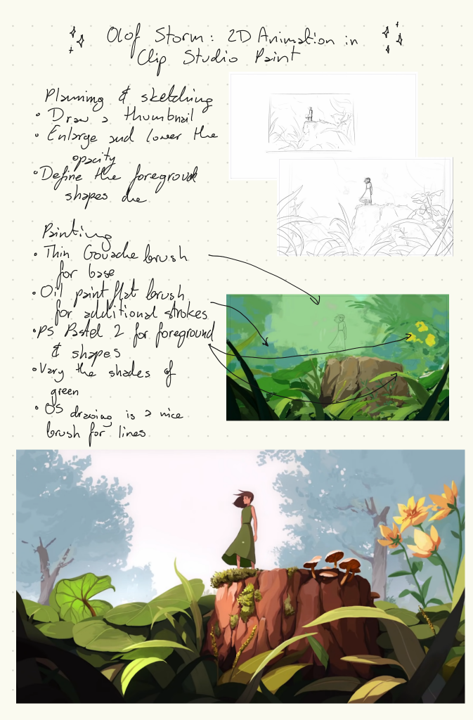
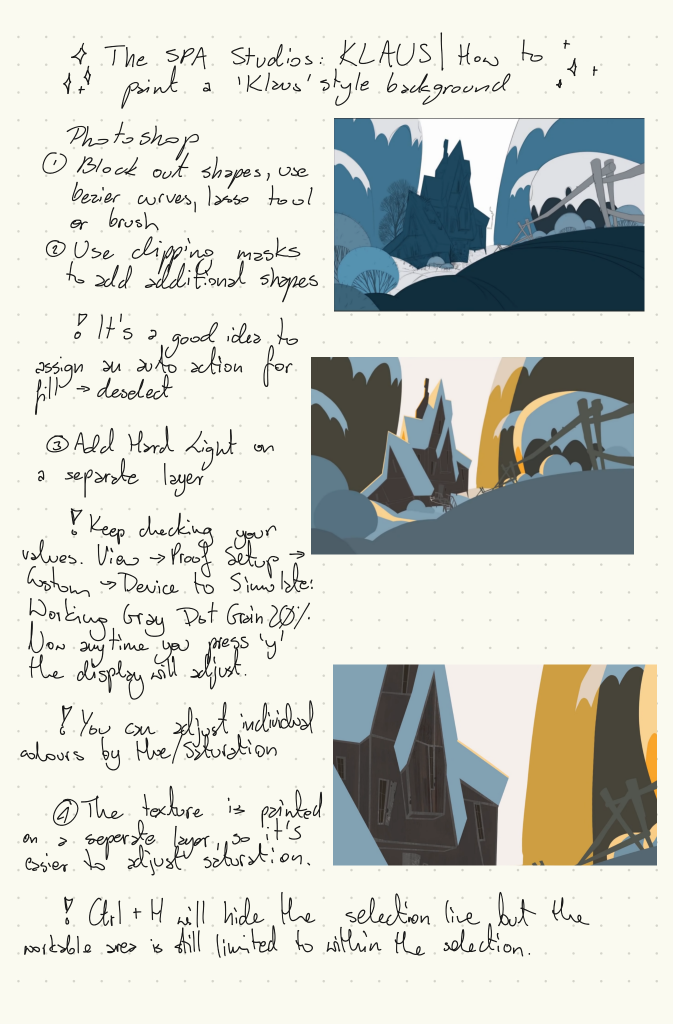
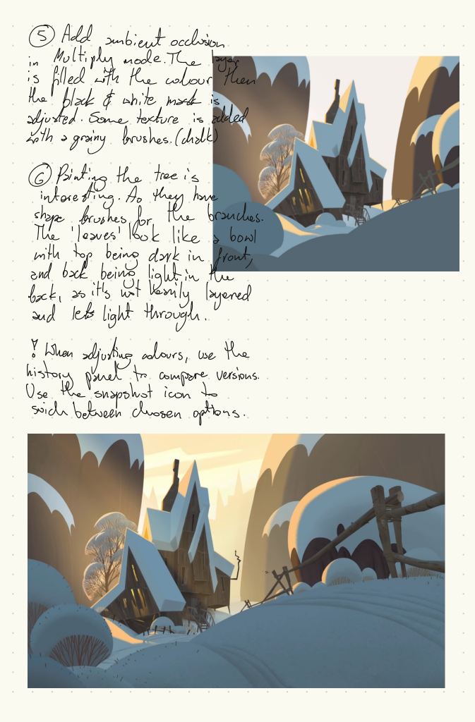
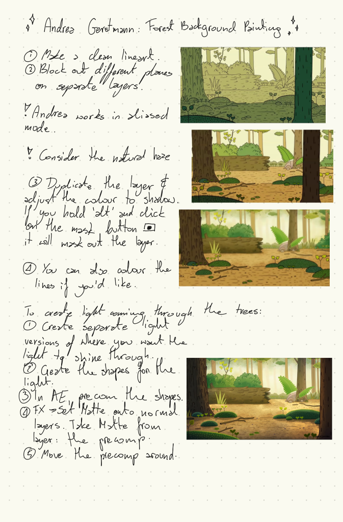
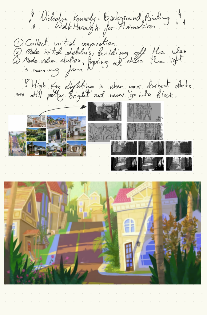
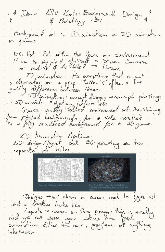
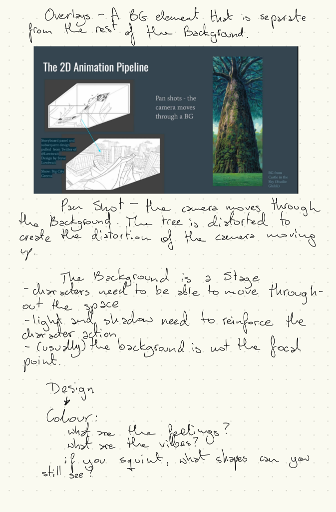
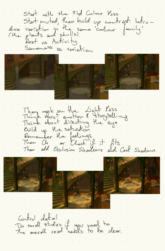
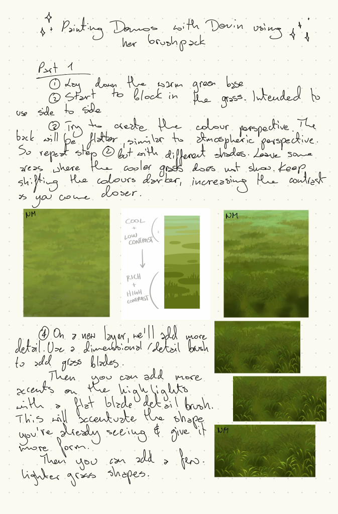
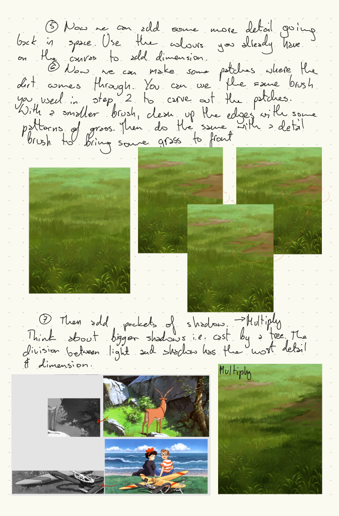
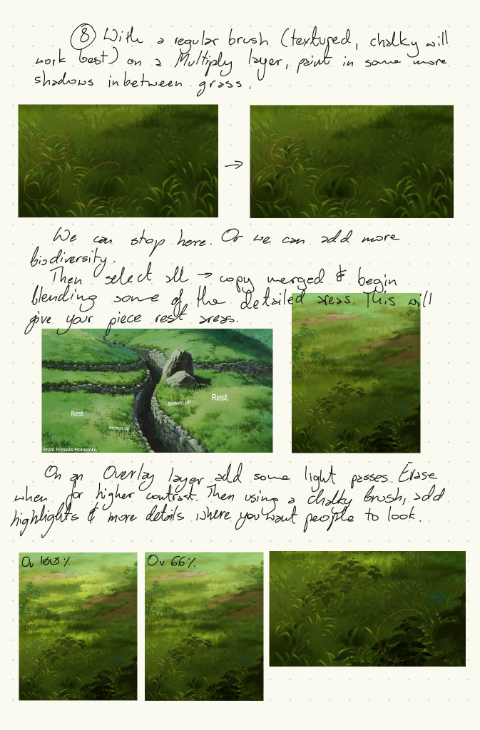
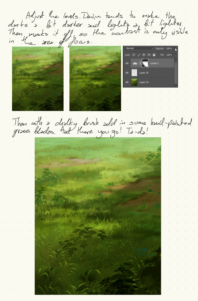
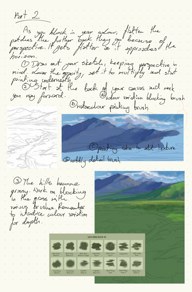
Before attempting backgrounds for the final piece, I looked into various Animation Background Painters’ work. I don’t expect my work to be at that level, however, it was very informative to see their workflow and gave me tools to feel more confident about the next steps. I have linked the videos below if anyone wants to explore them further.
Victor, Marco, Neale, Rebecca and I entered a 24 Hours Animation Contest for Students. In short, we had 24 hours to create a short animation for the “imagining the future” theme. The theme was announced at midnight, and we had until the following midnight to come up with the idea, script, storyboard, animate, and composite a short 30-second film.
We followed the theme of radiation that killed animals on earth, leaving humans to exploit cockroaches for their milk.
I had a great time organising the team and taking care of the production, as well as clean-up and colouring, and designing the milk carton. As production is definitely an avenue I’m interested in pursuing, I was glad to have a chance to be responsible for keeping track of everything.
Before the contest started, I organise a whatsapp and a discord group, including a system to figure out who was happy doing what, as I wanted us to use our strengths and learn from each other.
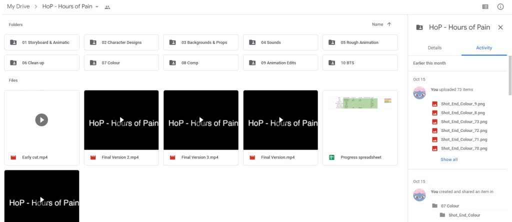
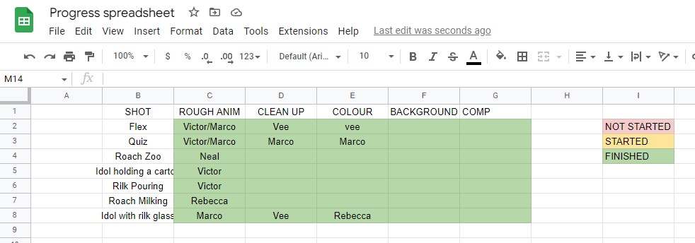
I also organised folders in an Online Google Drive so that we could all share the files as needed, and it doubled up as a backup. Additionally, I created a simple spreadsheet to track the progress and divide the work when needed – due to the nature of the contest, I didn’t want to spend too much of my time on this.
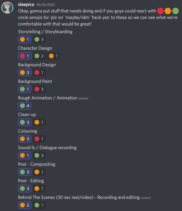
Different production tasks. Click to see full image
This was the first time our school entered the contest in the 20 years it’s been run. And the results announcement happened a week later, on the 21st of October… And…
Drumroll, please… We came 8th!!! Honestly, we couldn’t believe we managed to place in the top 10! It was a little disappointing, as only the top 5 get prizes (so close-) but still! The experience was absolutely wonderful and, actually, not as stressful as I imagined it to be. We all worked together really well and trusted each other to do our job. Teamwork truly makes the dream work.
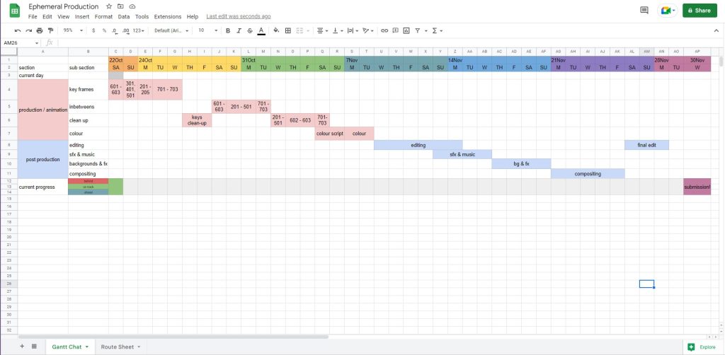
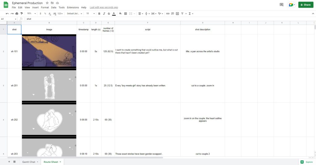
Today we had a meeting with Ko about Production and tools that will help us keep on track. We’ve learnt about Gantt charts and Route Sheets, both of which I found extremely helpful. And the more complicated the animation is, the more helpful they are. As well as this, these are extremely important if other people are going to work on the animation – especially to endure clear communication or when dividing the tasks.
I have put both the Gantt Chart and the Route Sheet into the same Excel document, so that I could keep them all together and not have a lot of the tabs open.
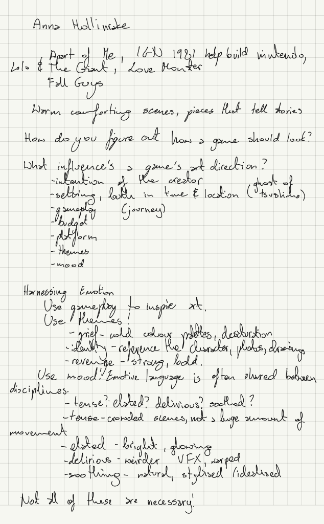
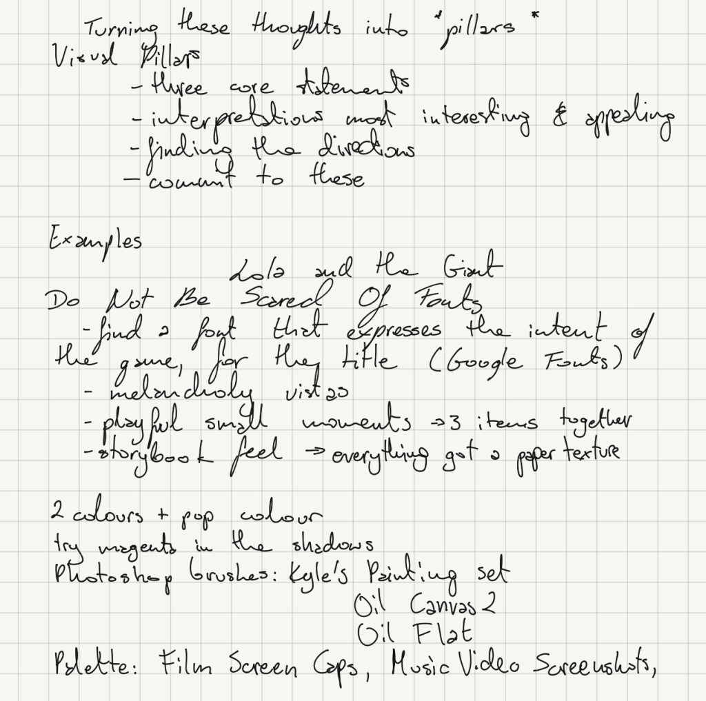
I attended an online event with Anna Hollinrake whose work I absolutely love. I met her and came across her work during MCM last year and followed their work since. I managed to get both prints signed, too! Anna was absolutely the nicest person ever. This just proves that even just a convention might get you new clients and people excited about your work.
So, I was super excited when I found out they were doing a webinar. It focused on game illustration, but I definitely feel all of her advice could be applied to any other form or genre of art. As well as this, animation is still present in games and this might be an avenue I’ll look into.
As soon as I knew whom I was paired with, I emailed Nicole. The initial communication was very quick, and we quickly swapped to instant messaging rather than email – as sending one-sentence emails wasn’t really useful and was more difficult to keep track of.
We got onto a video call and discussed Nicole’s project, she showed me the animatic and talked about the concept – basically gave me the whole pitch. This made me super excited to work on her film as I really love the aesthetic and story of it.
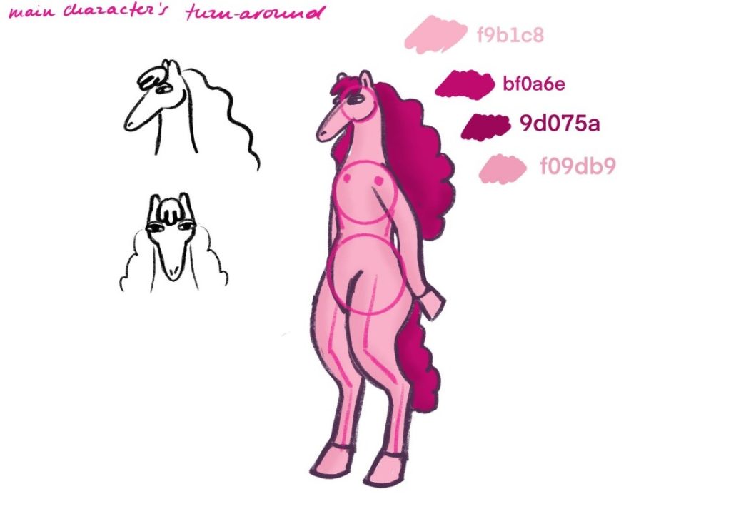
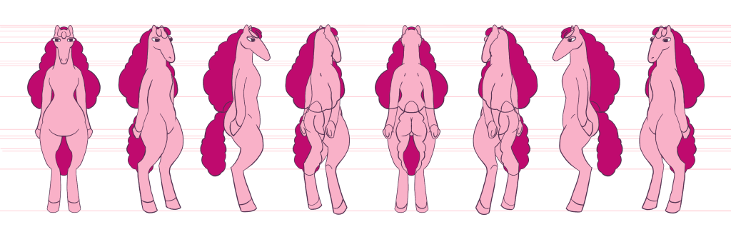
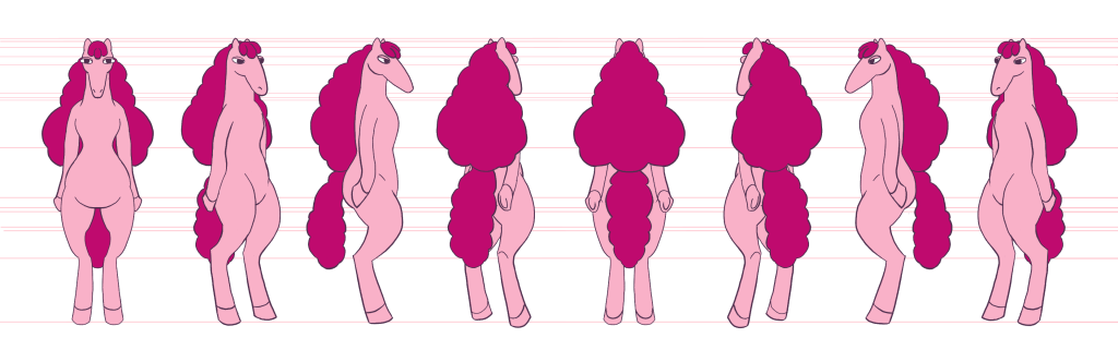
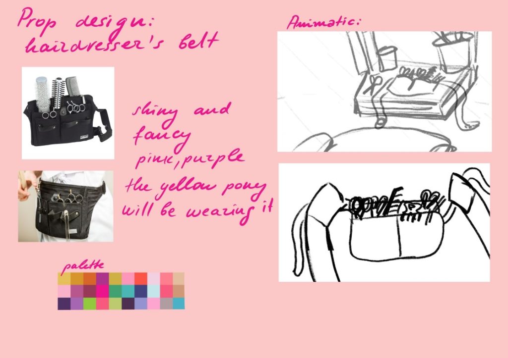
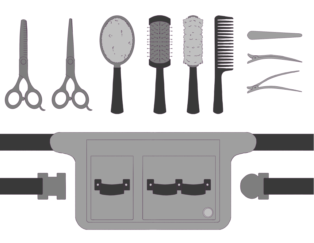
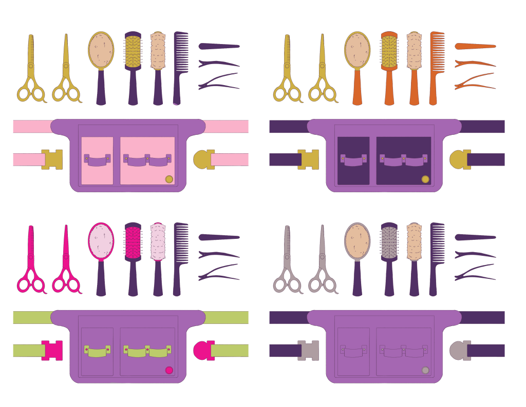
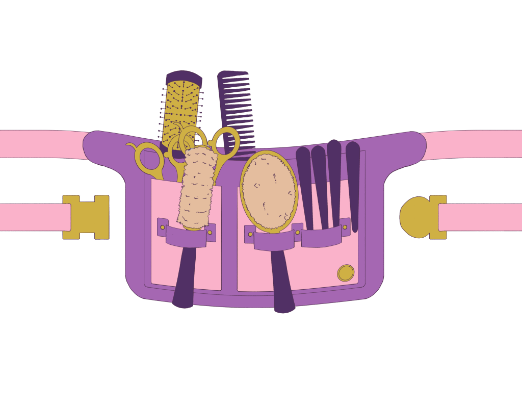
I’ve received three tasks: A Pony Character Turnaround, A Hairdresser’s Belt Prop Design, and A Background to paint. I’ve successfully completed the first two, but I am planning on painting the background later in the week. Prop and Background design is something I’m currently interested in, so I was looking forward to them.
A sketch I got from Nicole and the completed turnaround I did
A sketch and colour palette I got from Nicole as a guide. I then designed the props separately, before exploring colour combinations (Nicole specified the bag to be purple) and then combined everything for a final shot.
I don’t consider myself a good character designer at the moment, so I was glad to have the Pony design given, and I was happy to make a turnaround from it. I tried to utilise the knowledge I had from Bianca, when she came to talk about character design. I knew the importance of a good and consistent turnaround, using the lines in the background to keep track of various features. It made the task much less daunting.
On the other hand, I was very happy to have the Prop design more ambiguous and given more freedom in working with it. I did the research to make sure all the tools were included but opted to go for a soft bristle brush – inspired by horse brushes, as I felt it would fit the Pony World better. Following this, I definitely plan to look more into Prop and Background Design artists and their workflow. I’ve also purchased Melissa Malone’s intro to Background Art for TV Animation to start my research and to get more familiar with the requirements.
The work was done over the weekend, then the designs were sent off to Nicole for approval, and she really loved the belt – I’ve probably put into it more detail than she would have been able to, due to the fact she’s got so many other things to work on, and I could easily focus on it. But I’ve decided to put this amount of detail in because it’s the main prop, and it seemed like there will be close-up shots of it. Nicole also said she’ll just add the grunge texture to it so that the grain matched the aesthetic of the film – so I didn’t need to do any revisions! I also made sure to send her the raw files, so she could use them for models on any shots. It was very satisfying to send off work that got approved.
I wish I followed up sooner (our communication broke for a bit and I had to wait for a little to receive work) – as it wasn’t Nicole’s fault and life happens. But because I waited to be sent stuff after the initial call, it put extra pressure on me later, as I needed to fit it around other tasks in the latter week. So in the future, I’m definitely going to try and be more insistent on communication.
As well as this, if I had more time, I definitely would have liked to render the designs further- adding shading. It’s something I still might do later on. But I’m definitely looking forward to painting and designing the background from Nicole’s sketches. I particularly enjoyed seeing her workflow – the moodboards, the animatic and her pitch, her energy making me more excited about the project. It’s definitely something I would like to bring into my practice.
For my walking animation, I wanted to play more with the background design, as I have some interest in it and can see myself taking it more seriously. I knew I wanted to have a bakery or a sweet shop, which is where the mood of the walk changes as the shop is closed.
I started out with a moodboard of different storefronts.
And then I got to work!
It’s a simple straight-on background with a one-point perspective. It’s not a finalised design, but I am relatively happy with the first pass on it. I didn’t want to over-crowd it and I tried to keep the threes – big, medium, small – rule in my mind. I will possibly add some more detail to the pavement, now that I’m looking at it. I’ve also moved the plants to the side, so that they weren’t the centre of attention, and there was more focus on the bakery.
I also got some feedback from a friend, and when cleaning it up, I will try to keep in mind line weight and try to vary it by structure. Also, the canopy might have too much detail in perspective, so I would be looking to simplify that.
Although not part of the project, I wanted to share how I approached the design of one of my Dungeons and Dragons characters. I first started by creating a moodboard. I wanted an overall feel, a vibe, not necessarily something to strictly follow, but something that could inspire me and keep me on track.
Afterwards, I worked on the silhouette and design, using white, grey and black as I tried to consider the values at the same time. I tried to keep in mind how practical the outfit would be, while still staying true to the character.
I really liked the ‘heavy on the bottom silhouette and tried to push it further by layering different pieces. I’ve decided the shorter dress / skirt was more practical, as she was to be a fighter, and of course, I don’t want her tripping on the edge of the fabric.
I’ve actually taken some videos of myself (long deleted, spare me the embarrassment) to figure out the pose and proportions. The final design reminds me a little of SheRa design.
Of course, I couldn’t help myself and had to draw her with her orc wife, Mursha. I also played about with different light settings.
During a workshop with Bianca Ansems, we were asked to create a character using Stanislavski’s 7 steps of character exploration, then to create a turnaround. I wish I knew we were going to be asked to do that, as I don’t consider myself a strong character designer. And so I’ve spent quite a long time just researching the background and exploring the design. I will definitely be spending more time on this.
A cleaned-up design. I realise the side profile is not right at all, but I anticipate to re-do the design anyway.