Although Kate’s work wasn’t in the style that I would necessarily look to work in, I still found her general theme and practice interesting. It was really inspiring to learn from her experiences as an LGBTQ+ artist and the struggles that come with distributing her work (i.e. in Eastern Europe, although that seems to be slowly changing now).
Kate spoke about how the festival scene really advanced her career and improved her visibility. She had a chance to travel and take part in various workshops which were fantastic for her work development but also networking.
She has extensive experience working as a freelancer and shared many points that could help us on our own journey. She was even kind enough to give us a look at the contracts she normally sends out and the important details that need to be included (like payment deadline or number of revisions included).
Kate also expressed the importance of balancing personal work with any paid jobs that might not be as enjoyable.
“If Joanna Quinn could spend 10 years making toilet paper commercials to fund her independent projects, maybe you can do one explainer video.”
I had a fantastic time working alongside Mandy and helping her out – I have done research, created posts, and even had a chance to try making an ident.
I spent the first few days researching the relevant hashtags and groups for the relevant target markets, as well as collecting the artits’ details. This definitely made me realise how much easier it is to make promotional posts if all the information is already prepared. It also made me realise how much time it takes to collect people’s socials to tag them accurately – please send your socials along with your films. It will make everyone’s life easier. As well as this, I got much more confident using Google Sheets.
And then I had a chance to get creative with making the Instagram posts. Mandy was such a great teacher, too – I haven’t worked with Adobe InDesign before, but Mandy took the time to talk me through the program’s features. She already made templates for me, and it was up to me to update them with new information – however, I had free choice in what stills I chose from the films and was allowed to find the best spots for logos etc. Having this experience definitely made me realise how useful InDesign is for anything like promotional posts or flyers. Having a template to follow and pre-making the posts makes the whole process much more streamlined, and something I would implement on professional pages.
Some of the images I got to put together from Mandy’s templates:
As you might have noticed, I tried to give each post some sort of a colour theme.
As well as this, I had a chance to try animating the LIAF logo. It was a simple zoom-out and sketch effect of the logo. I won’t be posting it at the moment, as I would need to double-check with the team. However, I had a lot of fun with it and experimenting in Adobe After Effects. I got to research additional techniques – like how to make hand-drawn text from an Illustrator File. And I also learned how to package the file so that it could be sent across and re-opened and re-edited – which, previously to this I haven’t really looked into and didn’t think was an option.
I also managed to go the Best of the Fest to see all the winning animations, too. I think ‘Catisfaction’ by Andre Marques Almeida definitely caught me off-guard. It was definitely one of the most bizarre stories and visuals I’ve seen – and despite having seen stills from the film previously, I totally did not expect what I was about to watch. My other two favourites were definitely the ‘Zoon’ (Dir. Jonatan Schwenk) which definitely deserved its award for the best original score, but the visuals were also gorgeous along with an unusual storyline; as well as Luce and the Rock (Dir. Britt Raes) which impressed me with its use of 3 primary colours in its design.
I must say, London International Animation Festival is definitely one I will be looking forward to next year!
As soon as I knew whom I was paired with, I emailed Nicole. The initial communication was very quick, and we quickly swapped to instant messaging rather than email – as sending one-sentence emails wasn’t really useful and was more difficult to keep track of.
We got onto a video call and discussed Nicole’s project, she showed me the animatic and talked about the concept – basically gave me the whole pitch. This made me super excited to work on her film as I really love the aesthetic and story of it.
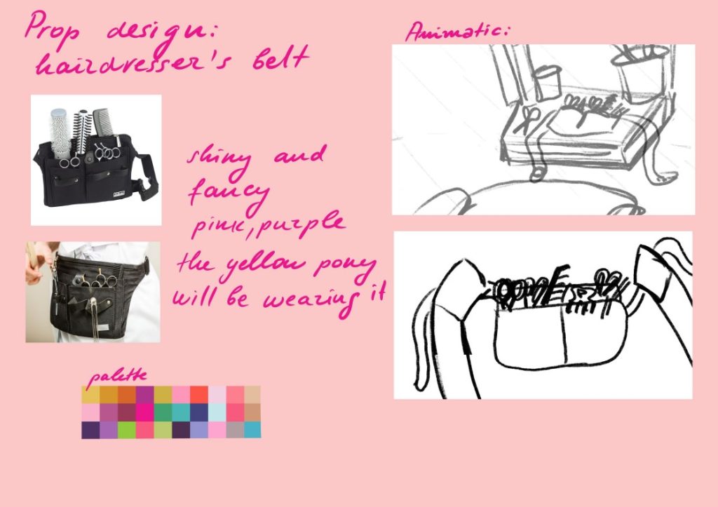
I’ve received three tasks: A Pony Character Turnaround, A Hairdresser’s Belt Prop Design, and A Background to paint. I’ve successfully completed the first two, but I am planning on painting the background later in the week. Prop and Background design is something I’m currently interested in, so I was looking forward to them.
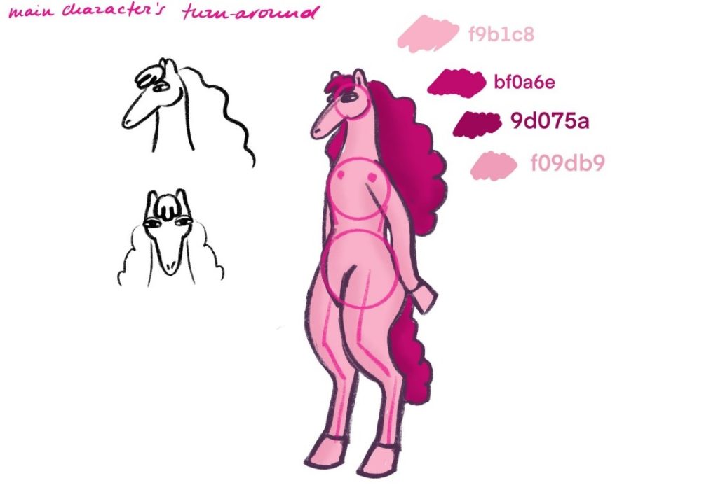
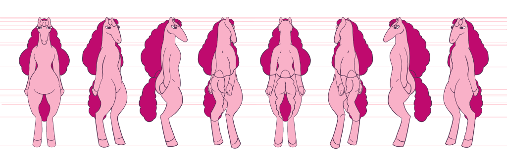
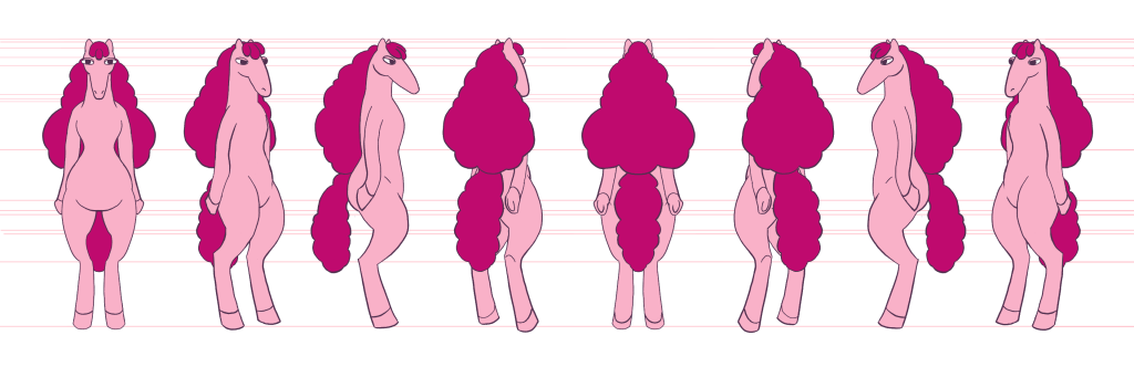
A sketch I got from Nicole and the completed turnaround I did
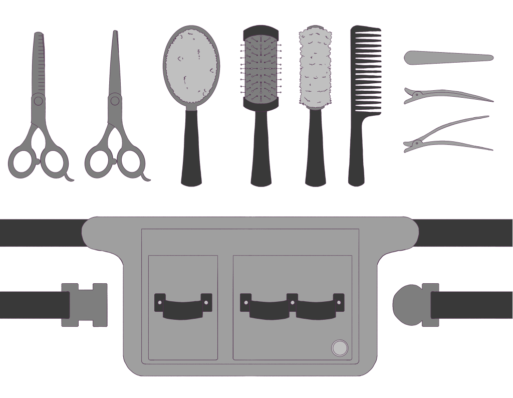
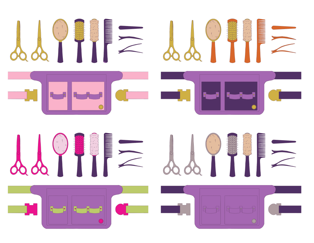
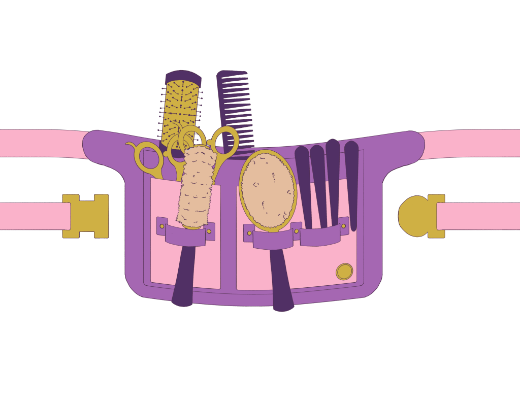
A sketch and colour palette I got from Nicole as a guide. I then designed the props separately, before exploring colour combinations (Nicole specified the bag to be purple) and then combined everything for a final shot.
I don’t consider myself a good character designer at the moment, so I was glad to have the Pony design given, and I was happy to make a turnaround from it. I tried to utilise the knowledge I had from Bianca, when she came to talk about character design. I knew the importance of a good and consistent turnaround, using the lines in the background to keep track of various features. It made the task much less daunting.
On the other hand, I was very happy to have the Prop design more ambiguous and given more freedom in working with it. I did the research to make sure all the tools were included but opted to go for a soft bristle brush – inspired by horse brushes, as I felt it would fit the Pony World better. Following this, I definitely plan to look more into Prop and Background Design artists and their workflow. I’ve also purchased Melissa Malone’s intro to Background Art for TV Animation to start my research and to get more familiar with the requirements.
The work was done over the weekend, then the designs were sent off to Nicole for approval, and she really loved the belt – I’ve probably put into it more detail than she would have been able to, due to the fact she’s got so many other things to work on, and I could easily focus on it. But I’ve decided to put this amount of detail in because it’s the main prop, and it seemed like there will be close-up shots of it. Nicole also said she’ll just add the grunge texture to it so that the grain matched the aesthetic of the film – so I didn’t need to do any revisions! I also made sure to send her the raw files, so she could use them for models on any shots. It was very satisfying to send off work that got approved.
I wish I followed up sooner (our communication broke for a bit and I had to wait for a little to receive work) – as it wasn’t Nicole’s fault and life happens. But because I waited to be sent stuff after the initial call, it put extra pressure on me later, as I needed to fit it around other tasks in the latter week. So in the future, I’m definitely going to try and be more insistent on communication.
As well as this, if I had more time, I definitely would have liked to render the designs further- adding shading. It’s something I still might do later on. But I’m definitely looking forward to painting and designing the background from Nicole’s sketches. I particularly enjoyed seeing her workflow – the moodboards, the animatic and her pitch, her energy making me more excited about the project. It’s definitely something I would like to bring into my practice.