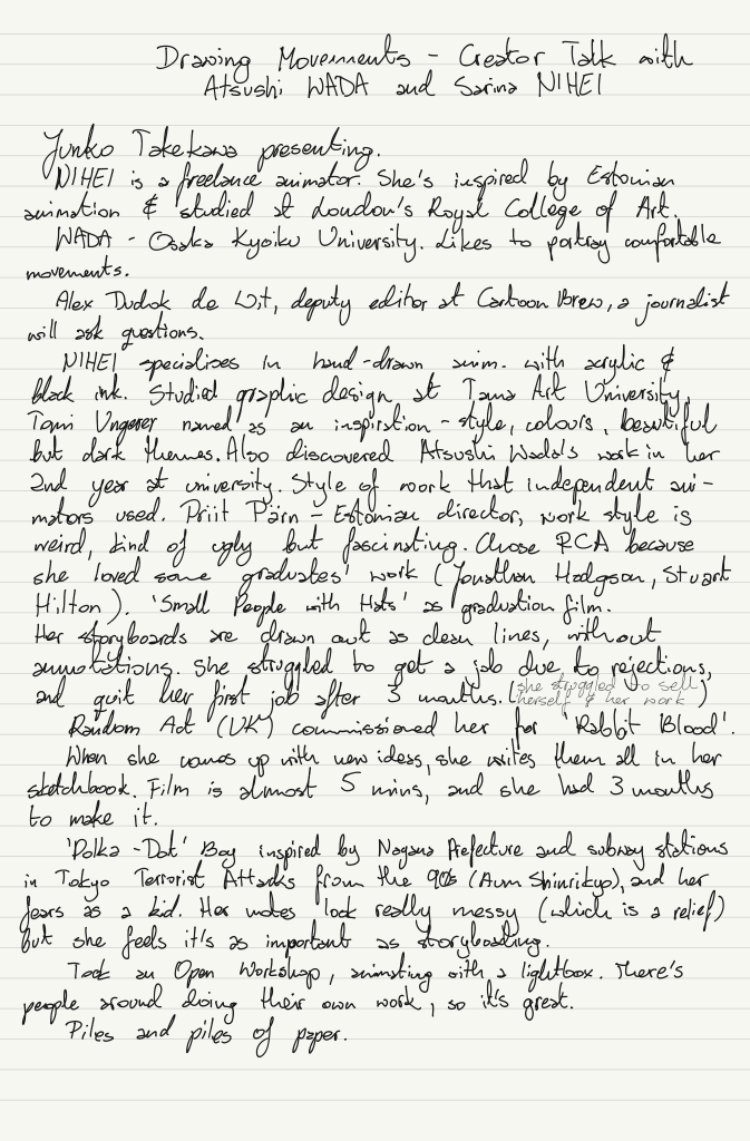
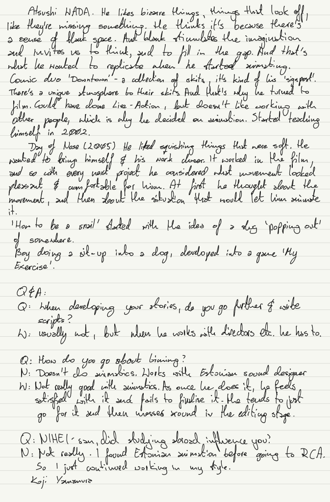
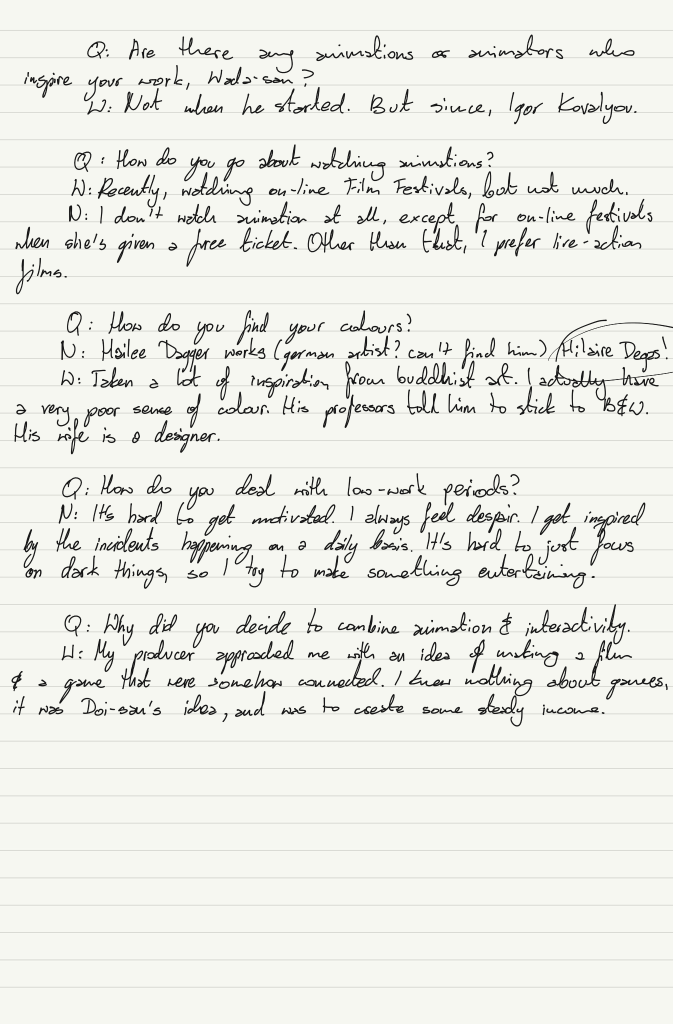
Zoom Call Crushie by Fishy Bishie
I’ve recently watched a short music video by Gaille/BishyFishie (both sang and designed/animated) and was absolutely mesmerised by the colour choices and the transitions. So, naturally, I needed to look more into it.
In the process video, they explain their workflow from planning and designing to making. I was actually surprised to find out they used Paint Tool Sai to paint each frame, export it as images and put the animation together in Sony Vegas. It truly shows that where there’s a will, there’s a way.
I personally have experience using Paint Tool Sai for illustration work in the past and, honestly, it’s the best program I ever experienced for lining and colouring. The brushes always did what I wanted and expected them to, just perfectly. Despite this, I can’t imagine not being able to playback the frames, hence why I don’t think I would ever use it to animate. However, I can see myself making the rough animation in TVPaint with all the timing figured out, then working on individual frames in a more illustrative program (such as Paint Tool Sai or Clip Studio Paint). The downside is, of course, the frames need to be exported as PNGs so any changes, later on, could be difficult to carry out.
I did really enjoy the way Gaille works out their frames/storyboards. They use a set of post-it notes in a sketchbook. This is certainly something I would like to adopt into my practice, mostly because I find myself moving frames around a lot – and when doing work digitally, it can become quite messy, trying to move between files or folders – while I imagine flipping a sketchbook page would be much easier. I worry I’ve become too digital sometimes, so I think this would be a nice way of getting back into a more ‘hands-on’ approach.
Although their colour scheme seems very minimal, I went ahead and colour-picked from multiple frames to get a better grasp of it. I quickly noticed that despite the scheme looking like it only consisted of 4 colours, it had much more to offer. Most of the colours are muted and “soft” which is what I think attracts me to them – they are easy on the eye and are in hues of reds and violets, shades of pink. Gaille avoids using black in this music video and instead goes for a darker ‘plum’ which unifies all of the design – noticing this reminded me about the talk we got from Sue Tong yesterday, where she mentioned that colouring the outline the colour of the prop/design could make the design softer, rather than having striking black lines. However, colouring the lines in n amount of different colours can be very time consuming (i.e. all bushes dark green, rocks dark grey etc.) – but choosing a single deeper colour other than black for all of the lineart can be a great way to unify and soften the art. So it’s definitely something I will consider and keep in mind.
I used to be rather scared of colour, but this quick and simple exercise definitely helped me. It showed me that I don’t need a full rainbow to have a cohesive and well-working colour palette.
On top of that, I truly love so many of the transitions and shots from the video, despite it being so short.
I really like how some frames ‘jump’ to the beat of the music. Especially when they’re still frames – it gives them a little bit of movement. On top of this, it feels to me like they’re a heartbeat, which works well due to the song being about love.
However, I found myself mesmerised by the shot at 0:09 and the smooth transition into the heart, then the bedroom scene, which takes less than 2 seconds.
I wanted to understand it better and not feel so intimidated by it. So I took multiple screenshots to analyse it. If I were to approach this transition, I think I would fully animate the ‘heart-smoke’ and then slide it in during compositing in After Effects. The bedroom scene quickly jumps into the shot from the top, but there’s a more subtle change that adds to the quick tempo of the song – the background lilac colour starts transitioning from yellow smoke into the final lilac when the scallop frame settles. It’s the little details and illusions that make it so smooth.
These are all little lessons I’ll definitely try to implement in my future projects – working with minimal, limited, cohesive palettes to build up the confidence with using more colours. Also, the transitions aren’t as scary as they seem, haha!